


Building Brand Identities Without an Illustration Budget
Pitching web design projects to small businesses always hits an identical friction point. Clients want a distinct, memorable visual identity setting them apart from competitors. They expect bespoke graphics, engaging empty states, and a polished user flow guiding their customers. Then comes the dreaded budget reveal. Barely covering basic development hours leaves absolutely zero financial room for hiring a dedicated illustrator.
Faced with tight deadlines, freelance designers typically resort to scattering disjointed stock vector files across a messy layout. A better approach relies on one cohesive asset library doing the heavy lifting. My workflow leans heavily on Ouch by Icons8 to bridge that gap between premium custom artwork and realistic project constraints.
The Reality of Small Business Timelines
Late Tuesday afternoon brings a panic call. A boutique logistics startup needed a complete landing page redesign by Friday morning. Getting an approachable, playful brand feel would offset their highly technical supply chain services. Hiring an illustrator to draft custom scenes for their hero section, feature breakdown, and pricing tiers takes three solid weeks. That timeframe would also consume their entire operating budget.
Immediate assets were my only viable option.
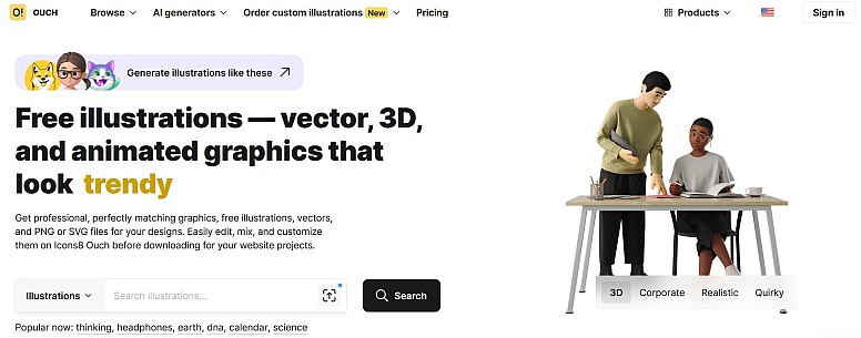
Opening the Pichon desktop app connected me directly to the Ouch library instantly. Filtering through 23,000 technology illustrations took just a few minutes. Bypassing flat corporate vectors led me to a specific aesthetic among 44 available 3D categories.
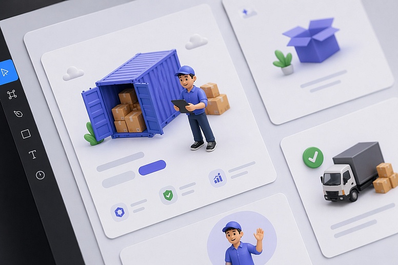
Dropping an isolated 3D shipping container directly onto my canvas felt great. Adding a matching 3D character holding a tablet completed the team section perfectly. Within two hours, my layout established a premium visual language. Client approval happened right away, securing our tight Friday launch schedule.
Defining a Visual System Off the Shelf
Many designers mistakenly believe off-the-shelf graphics can't support a true brand system. Visual consistency builds trust. Bold, colorful shapes with thick strokes on a homepage hero clash horribly with minimal monochrome line art at checkout.
Rigid organization across 101 illustration styles makes Ouch uniquely powerful. Selecting a specific aesthetic category gives you an extensive subset of graphics covering the entire user experience flow.
Start by pulling a complex, multi-character scene for your landing page hero section. Dive deeper into that exact same category next. Matching graphics exist for your add-to-cart confirmation, login modal, and 404 error page. Original illustrators built these sets specifically with UI designers in mind. Working with the library feels less like browsing a random image repository and more like adopting a scalable design system.
Constructing a Full User Flow from Scratch
Building a multipage portfolio site or client web app demands more than pre-made scenes. Flattened stock graphics permanently fuse backgrounds, characters, and props together into one unusable layer.
That doesn't work for modern interfaces.
Populating various empty states across a recent SaaS dashboard required specific, simple line graphics. Searching Ouch revealed a perfect scene, but it included unnecessary elements for my small widget area. Layered vector graphics came to the rescue. Broken down into tagged, searchable objects, these files offer incredible flexibility.
Extracting just the folder icon and stylized character from the composition took seconds using their free online Mega Creator. Rearranging those isolated elements fits my narrow container dimensions perfectly. Recoloring the character's shirt matched my client's primary hex code exactly. Object-level control transforms standard library assets into interface-specific components.
Elevating Interfaces with Cohesive Motion
Static pages rarely impress modern clients today. Small businesses increasingly ask for motion, making their web presence feel like a premium mobile application. Integrating animation usually means hunting for random GIFs online. Those almost inevitably clash with your static vector artwork on other pages.
Motion integrates directly into existing Ouch style categories natively. Working on a waiting screen for a booking application meant finding a visual distraction matching my established static branding.
Searching the library for animated illustrations yielded continuous loops. Exporting my chosen asset as a Lottie JSON file kept things extremely lightweight.
Dropping that JSON directly into the web build provided high-fidelity animation instantly. Page load times stayed perfectly fast during testing. Best of all, the movement remained visually identical to the static graphics on the previous screen.
Evaluating the Illustration Market Landscape
Cycling through several resources helps me adapt to different project parameters. Comparing tools reveals clear winners for specific design situations.
- unDraw: Developers love this staple because it's entirely free and permits rapid primary color adjustments. Ubiquity remains its major drawback. Seeing that single unDraw style across the tech industry immediately signals a low-budget project to savvy users.

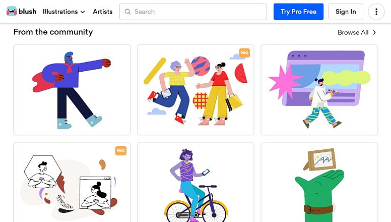
- Blush: Tweaking character poses and swapping specific components within an illustration works wonderfully here. Customization is excellent, but sets remain small and highly curated. Finding niche concepts like specialized healthcare objects or obscure educational items proves difficult. Ouch offers vastly more volume.
- Freepik: Sheer volume makes this platform massive. Building a consistent UI flow across 15 pages here becomes a massive exercise in frustration. Hours vanish while hunting for similar-looking graphics from different creators. You often fail at finding matching assets for obscure UX states like a failed payment screen.

When Ouch Is Not the Right Fit
Generic screens vanish with Ouch, but certain client engagements demand different approaches entirely.
Proprietary mascots or highly specific visual metaphors require hiring a custom illustrator immediately. Stock libraries don't offer exclusivity. Competitors can and will download your graphics for their own campaigns.
Budgeting for the appropriate tier matters greatly too. Free accounts provide PNG files while strictly requiring an attribution link back to Icons8. Professional client work rarely tolerates attribution links in site footers or main navigation menus. Upgrading to a Pro plan removes that strict requirement completely. Paying members also secure high-resolution files and unlock SVG formats essential for precise color editing.
Field-Tested Strategies for UI Designers
Optimizing a library-driven workflow takes real discipline. Follow these steps for the absolute best results.
- Commit to a single style: Never mix a bold 3D style with minimal monochrome vectors. Pick one of the 101 styles and refuse deviation. Tempting graphics in another style aren't worth breaking your hard-earned visual consistency.
- Work with vector formats: Always use the Pro plan for downloading SVGs. Bringing an SVG into your design tool lets you strip out unnecessary background blobs easily. Tweaking specific node colors matches the client's brand palette perfectly every single time.
- Manage your credits: Paid plans operate on a download credit system with helpful rollover benefits. Group your asset gathering into focused weekly sessions. Managing your monthly allowance efficiently across different client projects saves both time and money.
Building a memorable web presence on a strict budget means making smart compromises. Structured illustration libraries help freelance designers deliver professional brand systems quickly. Everything looks custom-made. Bypassing bespoke illustration costs entirely just makes good business sense.


?")


0.1381