

Directional Signage That Teaches Buildings To Speak
Every large building tells a story. Corridors lead somewhere, elevators connect levels, and people constantly move between spaces. But without a clear system to guide them, even the most beautiful architecture becomes confusing.
Directional signage is what gives a building its voice — a way to speak to everyone who enters. You can find functional and well-designed solutions for this kind of navigation when you buy on the Bsign Store.
Purpose of directional signage
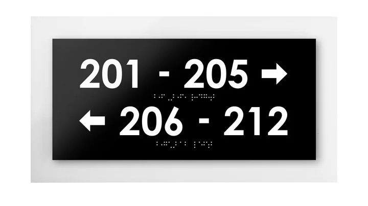
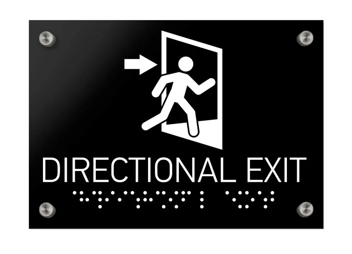
Directional signage helps people find their way without asking for directions. It turns what could be a maze into a readable map. Arrows, icons, and simple words like Reception, Restrooms, or Conference Hall may seem minor, but they save time and reduce frustration.
Good signage is not only practical. It builds confidence. Visitors who understand where they are feel welcome and in control. In workplaces, it supports daily routines; in hotels, it ensures smooth guest experiences. Without clear direction, even well-designed buildings lose efficiency and comfort.
Where directional signs are needed most
Different environments use directional signage in different ways:
- In hotels, signs guide guests from the lobby to their rooms, restaurants, and spa areas. The best systems use subtle contrast and materials that blend with the interior — acrylic plates for modern spaces or engraved wood for boutique hotels.
- In offices, directional signs organize everyday movement: departments, meeting rooms, and emergency exits. Clear typography and consistent color schemes turn navigation into part of corporate design.
- Shopping centers and airports depend on signage more than any other place. Thousands of people follow arrows and icons each hour, often without realizing how much thought went into their placement. Legibility, visibility, and consistency are key here.
- Hospitals and clinics need calm, unambiguous direction. Patients should never feel lost, so signs use high-contrast fonts, neutral colors, and clear symbols.
Universities and public buildings benefit from durable materials and large-scale systems. Color-coded levels or zones help people understand the layout quickly, even during busy hours.
Design that guides without words
Effective directional signage works before a person even reads it. The brain reacts first to shape, color, and placement. Designers use these cues to lead people naturally through a space.
For example, vertical signs draw attention at entrances, while horizontal wall plates work best along corridors.
Material also plays a role. Acrylic plates feel light and contemporary. Brushed stainless steel looks serious and professional. Wood softens modern spaces and adds warmth to hotels or resorts. The best systems mix function and aesthetics — signs that guide but still belong visually to the environment.
Integrating directional signage into interiors
When planned early, signage becomes a natural part of the building rather than an afterthought. Designers align fonts, colors, and finishes with the architecture. A dark corridor might need big plaques; a bright, minimalist office might only need clean black text on white panels.
Consistency across floors and departments reinforces identity. Visitors begin to recognize patterns — the same arrows, same materials, same logic. It’s a silent agreement between the building and its users.
Directional systems also adapt to accessibility standards. High-contrast colors, raised letters, and braille ensure that everyone can move independently. Thoughtful design serves both form and empathy.
A building that communicates
When directional signage works well, people don’t notice it — and that’s the point. They walk confidently, never thinking about how they knew where to go. The space itself feels intuitive.
In the end, good wayfinding is not decoration. It’s communication — a language of clarity and care. Buildings that «speak» clearly invite people to stay, to explore, and to trust their environment.
That’s the quiet power of directional signage: it helps architecture make sense.
?")


")


0.0313