


Digital Creativity: From Pixels to Polish
You spend your days in the digital realm—optimizing workflows, parsing code, and designing interfaces. But sometimes, the most satisfying click isn't a mouse button; it's the snap of a marker cap or the gentle brushstroke on a nail. Creativity needs an analog outlet. For the tech-minded, this isn't about abandoning screens; it's about using them as a springboard into hands-on making.
Code Your Canvas: Where Tech Meets Tangible Art
Think of it as a different kind of UI. The principles are the same: an understanding of space, color theory, and clean lines. We're just switching the canvas from the screen to paper and fingertips. This is about finding flow state outside your IDE, reducing digital eye strain, and creating something in the real world you can hold—or wear.
The Stack for Your Next Project:
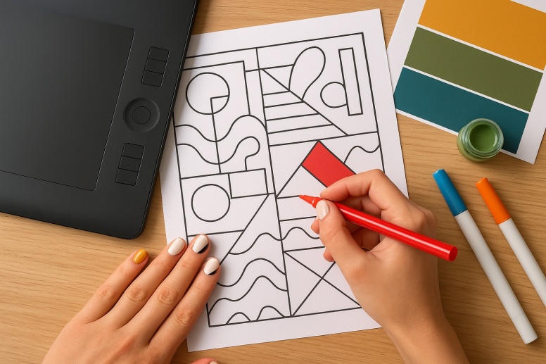
- Sourcing Assets: Where to find high-resolution, vector-friendly printable coloring pages.
- Minimalist Nail Art: Designs that use precision, negative space, and clean lines.
- The Toolchain: Simple, effective physical tools for optimal output.
- The Debugging Phase: Troubleshooting common mistakes for flawless results.
- Merging Concepts: Using digital color palettes to guide your analog projects.
Sourcing Your Base Assets: The Best Printable Coloring Pages
In web design, you don't build every asset from scratch. You use libraries, frameworks, and open-source resources. Consider printable coloring pages your creative CDN. A high-quality page is like a well-structured HTML skeleton—it provides the foundation you can style with your own "CSS."
The goal is to find pages with clean lines, good negative space, and interesting forms. Avoid cluttered, low-resolution images; they're the equivalent of bloated, unoptimized code. You want a file that won't fight you during the "styling" phase with markers or pencils.
Repositories for High-Quality 'Templates'
- FreePik: A fantastic resource for vector (SVG) illustrations. Many are free with attribution. The lines are typically crisp and scalable, perfect for a clean coloring experience. It’s a treasure trove for geometric and modern designs.
- Linearity (formerly Vectornator) Templates: Offers a collection of free, beautifully illustrated coloring pages. The designs often have a contemporary, graphic feel that appeals to a design-focused audience.
- GitHub: Surprise! Some developers and designers share their vector art projects here. Searching for "SVG coloring pages" can yield unique, community-driven results.
Pro Tip: Look for pages saved as PDFs or SVGs. They maintain resolution at any size, unlike raster images (JPG, PNG), which can pixelate when scaled. This is basic responsive design, but for paper.
The Minimalist Nail Art Protocol
Nail art might conjure images of complex, airbrushed dragons. Forget that. For the developer and designer, it's about applying UI principles to a tiny, ten-pixel canvas. Think of your nail as a micro-interaction. The design should be intentional, clean, and enhance the user's (your) experience.
This approach favors precision over flair. It uses tools you already understand: tape for straight lines, dotting tools for consistent circles, and negative space as a core design element.
The Essential Tool Array
You don't need a full suite. A minimal setup is efficient and effective.
- A Base and Top Coat: Think of this as your
<html>and</html>tags. They encapsulate your design, protect it, and make it last. - A Few Core Colors: A pure white, a jet black, and 2-3 accent colors. This is your base palette. You can create countless schemes from this.
- Scotch Tape: Your tool for creating sharp, geometric lines and color blocks. It's the
borderproperty of the nail art world. - A Mechanical Pencil (unsharpened) or a Bobby Pin: A perfect, inexpensive dotting tool. Consistency is key.
- A Small, Flat Brush: For cleaning up edges around your cuticles—the equivalent of fixing a UI overflow.
Execution: Writing Your 'Stylesheet'
Let's build a few "design patterns."
- The Accent Nail (
nth-child): Paint all nails a single, solid color. Choose one nail (like the ring finger) to be different. This is a focal point. It's simple, modern, and effective. - Geometric Lines (
border-top):- Paint your nails with a base color and let it dry completely.
- Cut a thin strip of scotch tape and place it across your nail to section it off.
- Paint the exposed section with a contrasting color.
- Carefully peel off the tape while the polish is still wet to reveal a razor-sharp line.
- Dot Grid (
background-image: radial-gradient):- Apply your base color.
- Dip the end of your mechanical pencil or a bobby pin into the polish.
- Gently press it onto the nail to create a perfect dot.
- Repeat to create a pattern—a single line, a cluster, or a full grid.
Debugging Common Errors
- Bubbling: Caused by shaking the polish bottle or applying coats that are too thick.
Solution: Roll the bottle between your palms. Apply thin, even layers. - Smudging: The top coat drags the underlying, still-wet design.
Solution: Ensure each layer is completely touch-dry before applying the next. Use quick-dry drops if impatient. - Flooding the Cuticle: Polish spills onto the skin.
Solution: Leave a tiny, unpainted margin around the edge of your nail. Use your cleanup brush dipped in polish remover to correct any mistakes.
Integrating Your Digital and Analog Workflows
The bridge between your screen and your creations is color. Don't guess. Use your digital tools to plan your analog projects.
- Grab a Color Palette: See a gradient on a website you admire? Use a browser extension like ColorZilla to sample the hex codes.
- Translate to Physical Media: Take those hex codes to an art store or online shop. Brands like Copic Markers, Prismacolor, and even some nail polish brands have cross-referenced systems or similar shades. Alternatively, use a paint mixing app to find the closest polish match.
- Apply the Palette: Use this curated palette on your printable coloring page or your nail art design. You're essentially porting a digital theme into a physical format.
This process turns a fun activity into a deliberate exercise in design application. You're not just coloring; you're testing a color scheme in a new medium.
Your Creative Merge Request
The goal isn't to become a master artist. It's to engage a different part of your brain using the principles you already know. It's about the tangible satisfaction of a perfectly filled shape or a crisp line of polish—a small, deployed project you carry with you.
So, the next time you're stuck on a bug or need a mental reset, fork your creativity. Find a complex, geometric SVG coloring page, print it, and color it using a palette from your latest design mockup. Then, translate one accent color from that palette onto a single nail. Merge the concepts. Ship something to your hands.
Frequently Asked Questions
What if I'm not good at drawing? This is not about drawing. It is about coloring within the lines—a task any developer familiar with constraints and boundaries can excel at. The drawing is already done for you; you are handling the styling.
My hands are not steady. Can I still do neat nail art? Yes. The tape trick for straight lines exists for this reason. For other designs, rest your painting hand on a table and support your painting finger with your other hand. It provides stability.
What kind of paper is best for printable coloring pages? A medium-weight cardstock (around 80-100 lb text weight) is ideal. It prevents bleed-through from markers and can handle layered coloring with pencils better than standard printer paper.
How long should I wait between coats of nail polish? This is the most critical part. Wait at least two full minutes between thin coats. If you can lightly tap two nails together without them sticking, it's dry enough for the next layer. Rushing this is the primary cause of failure.
Can I use the same color theory from UI design for this? Absolutely. Analogous color schemes for a harmonious look, complementary for high contrast and pop. The principles of accessibility (enough contrast) and visual hierarchy (an accent nail) translate directly.
LEAVE A COMMENT


?")


0.1462