


How to Pick the Best Fonts for Your Website
When designing a website there's plenty to think about. Between creating your content and choosing the best images, certain essential elements could fall to the sidelines. There's one important aspect you're not going to forget and it is fonts.
General Information
Typography is able to communicate more about your brand's image than just words. Therefore, the typefaces used in your web design will enhance your brand's voice and also appear sharp on the display.
Fonts are a crucial element of branding. Ensure that the fonts' design scheme is compatible with your other visual assets for your brand. It doesn't matter if it's chic and stylish or rough and wild, the use of typography should be a part of your website's overall narrative.
As a general rule, don't use more than three different fonts on your web page. Limiting fonts improves your site's design and makes it more user-friendly.
Text with a dark background works well for books and blogs since it offers the reader an improved reading experience when reading longer text blocks. The use of coloured type is best restricted to headlines as well as display texts.
Significance Levels of Fonts
Each of these fonts must be considered to have different significance levels. To ensure a sense of hierarchy, pick the primary font, an additional font, and an accent font.
The primary font you choose is the most noticeable one and is recommended for use on the homepage of your website. It's the font that is the most prominently associated with your company even if it's not the most frequently used font on the site. This means that the primary font could be more distinctive and dominant in comparison to the other fonts that you have on your site.
The font you choose for your secondary will be used throughout the majority of your website's written content. This includes descriptions, paragraphs, and blog posts, among others. Although your main font may be distinctive and eye-catching, your secondary font must be, in the first place, extremely legible. Fonts with too many details are difficult to read when used on lengthy parts of the text.
The last thing to note is that the accent font you choose is one you'll make use of for a particular reason. For websites, the accent font is typically reserved for calls-to-action and directing attention to your call-to-action (CTA) button on the webpage. The font you use for your logo is another possibility that could be utilized for accents.
Serif, Sans Serif, Script Font Types
Typography is incredibly rich and complex, from legibility to alignment of text and spacing. To begin, you should focus on the most crucial class first: serif, script, and sans serif fonts. Here's a brief description of each and when you should make use of these fonts.
Serif fonts are with tiny lines in the middle of the stroke within an alphabet or symbol. These are regarded as classical and elegant and are often associated with printing. They are Times New Roman, Georgia, and Bodoni.
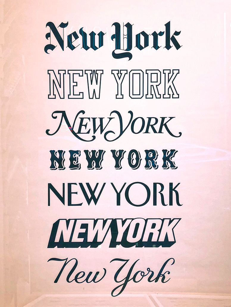
Sans serif fonts are fonts with serif lines that are at the end of their letters. Sans serif fonts are sleek, contemporary, and generally neutral and are a perfect choice for web-based design. Examples include Helvetica and the notorious Comic Sans. For more inspiration, you could try out some free Adobe fonts.
Fonts for scripts include cursive fonts and are inspired by handwriting styles. It's recommended to limit this style to titles since the writing of your text using a script will probably pose a challenge for your readers. For example, the most popular are Lobster and Lucida Handwriting.
When crafting the perfect website design, choosing the right typography is critical to creating a visually cohesive and engaging user experience. Fonts are more than just decorative elements; they play a vital role in conveying your brand's personality and ensuring readability. To make the process simpler, consider partnering with this company, which offers expert guidance to refine your design choices and create impactful content. By thoughtfully selecting typefaces that align with your brand’s aesthetic and purpose, you can build a website that not only looks professional but also resonates with your audience.
LEAVE A COMMENT


?")


0.1751