



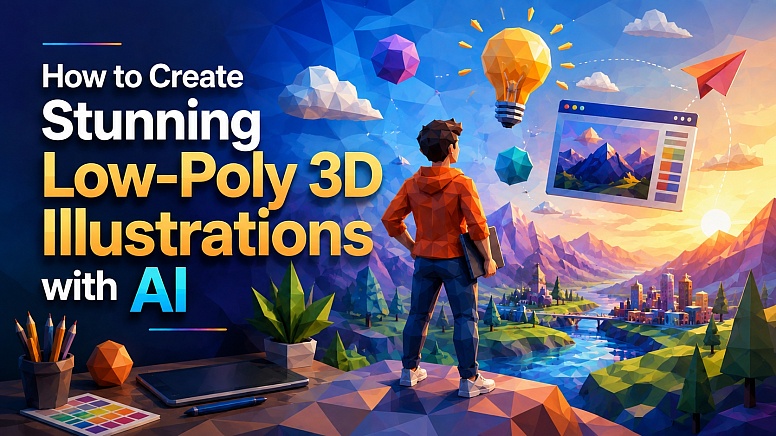
How to Create Stunning Low-Poly 3D Illustrations with AI
AI image generation has made it much easier to create original visuals for websites, blogs, and social media. But getting a genuinely good result isn't simply a matter of typing a few words into an image generator and hoping for the best.
The most interesting AI-generated images usually start with a strong visual idea. One style that works particularly well for digital content is the low-poly 3D editorial illustration. It combines faceted geometric shapes, vibrant colours, dramatic lighting and conceptual storytelling to turn an abstract idea into something visually memorable.
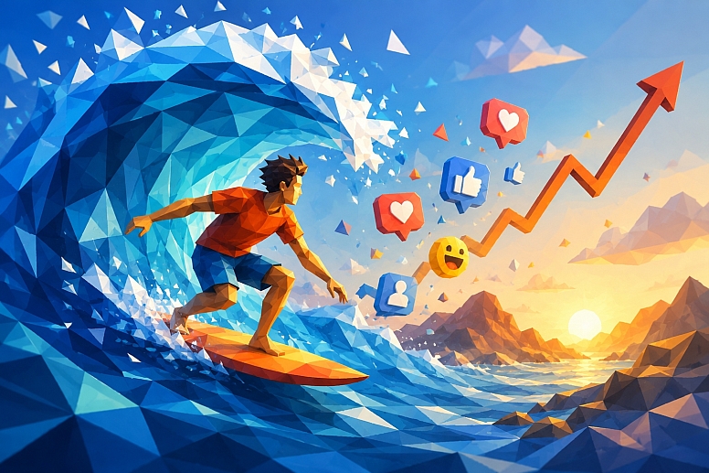
For example, an article about riding a viral trend could simply use an image of a phone displaying social media posts. A much stronger concept might show a surfer riding a huge geometric wave while social engagement symbols rise around them.
The second image tells the story before the reader has even started reading.
What Is a Low-Poly 3D Illustration?
Low-poly artwork uses relatively simple geometric surfaces to create objects, people, landscapes and environments.
Instead of smooth, highly realistic surfaces, the image is made up of visible polygonal facets. The result can look simultaneously three-dimensional, modern and stylised.
For editorial illustrations, the style can be pushed further with:
- Bright, contrasting colours
- Cinematic lighting
- Geometric landscapes
- Simplified characters
- Dramatic perspective
- Abstract visual elements
- Strong focal points
- Conceptual metaphors
The important part is that the image doesn't have to reproduce reality. It needs to communicate an idea.
That makes the style particularly useful for technology, marketing, business, design, and social media articles where the subject itself may be difficult to photograph.
There is also an important distinction worth making. A low-poly 3D illustration generated with AI is not necessarily the same thing as a technically optimised low-polygon 3D model created in software such as Blender. In this article, low-poly primarily refers to the visual style: faceted geometric surfaces, angular forms, simplified shapes and a stylised three-dimensional appearance.
The aim is not to build a perfectly optimised 3D mesh. It is to create an illustration that uses the visual language of low-poly 3D artwork to communicate an idea.
Why Low-Poly 3D Works So Well for Editorial Content
Some subjects are difficult to represent with traditional photography. How do you photograph cloud computing, SEO growth, artificial intelligence, cybersecurity, website performance, or digital transformation?
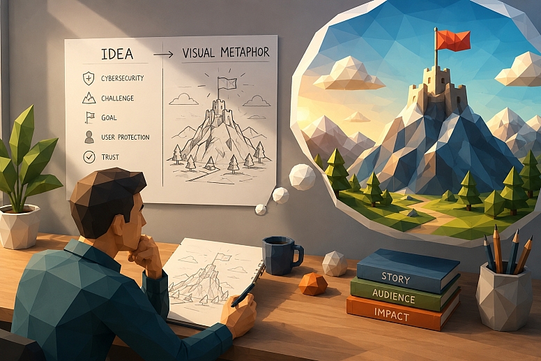
You could use a stock photograph of someone sitting at a laptop, but that often tells the reader very little about the actual subject.
Conceptual 3D illustration gives you much more freedom.
A cybersecurity article can become a geometric fortress. Cloud computing can become a floating city. Artificial intelligence can become an interconnected machine. A website redesign can become a futuristic construction site.
This makes low-poly illustration particularly useful for technology, business, web design, software, marketing, and other subjects that are difficult to photograph literally.
Choose the Right AI Image Generator
Before writing your prompt, decide which AI image generator you want to use. There is no single tool that is perfect for every type of illustration, so the best choice depends on the kind of control and workflow you prefer.
Popular options include ChatGPT image generation, Midjourney, Adobe Firefly, Ideogram and Leonardo AI. Their interfaces, models, editing features, reference-image capabilities, output quality and commercial-use terms can change over time, so check the current documentation for whichever service you choose.
ChatGPT Image Generation
ChatGPT is useful when you want to develop the concept and image together. You can describe an idea, generate an image, identify problems and request changes without necessarily rebuilding the entire concept from scratch.
This makes it particularly useful for editorial illustrations where the visual direction develops through several iterations.
Midjourney
Midjourney is well suited to highly stylised artwork and provides a range of controls for composition, image references, style, personalisation, aspect ratio and variations.
It can be particularly useful when the visual aesthetic itself is an important part of the project.
Adobe Firefly

Adobe Firefly can be useful when image generation is part of a wider design workflow. It is especially relevant to designers who already work with Adobe's creative tools.
Ideogram
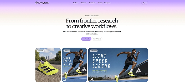
Ideogram is worth considering when an image requires typography, graphic-design elements, or a poster-like composition. It also offers image editing and reference-based features.
Leonardo AI
Leonardo AI provides image generation, editing, upscaling, and image-reference workflows. It can be useful when you want additional control over the appearance and refinement of generated artwork.
You don't need to use every platform. Choose one that suits your workflow and learn how to get consistent results from it.
Start With the Idea, Not the Image
One of the easiest mistakes to make with AI image generation is starting with a visual description before deciding what the image should actually communicate.
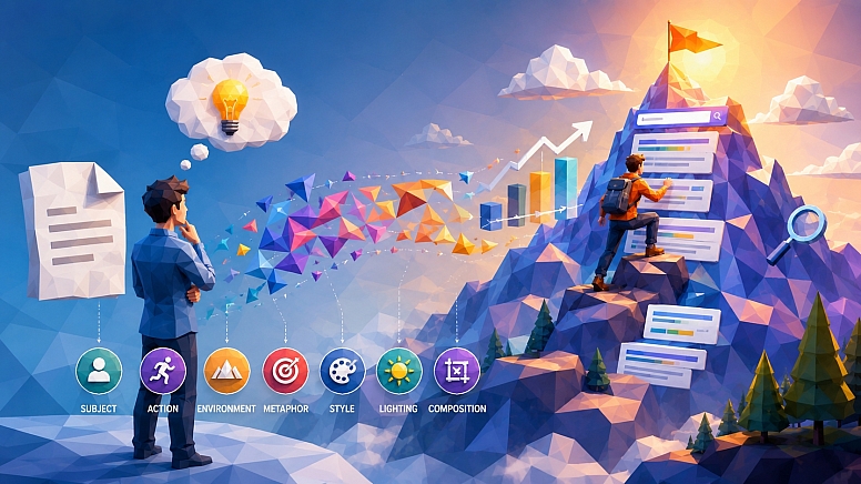
Instead, start with the article.
Ask: What is the main idea I want the reader to understand?
Then find a visual metaphor for it.
| Article topic | Visual concept |
|---|---|
| Riding a viral trend | Surfer riding a giant wave |
| Cybersecurity | Digital fortress protecting glowing data |
| SEO growth | Climber ascending a search-ranking mountain |
| Cloud computing | Geometric city floating above clouds |
| Email marketing | Paper planes travelling between connected platforms |
| Website performance | Futuristic racing car moving along a digital track |
| AI development | Designer building a machine from glowing geometric components |
| IT asset management | Central digital hub connecting laptops, phones, servers and software |
This approach produces much more interesting results than simply asking an image generator to illustrate the article title literally.
Think in Visual Metaphors
A visual metaphor gives the image something to say. Suppose you're writing about businesses trying to follow viral trends.
You could generate a person looking at a smartphone showing a viral social media post. There's nothing particularly wrong with that image, but it's predictable.
Instead, think about the phrase "ride a trend." That immediately suggests surfing.
Now you have a much stronger concept: a surfer riding a giant geometric wave while social-media reactions and an upward-trending graph move alongside them.
The image communicates momentum, popularity, timing, and risk without needing any explanatory text.
That's the kind of thinking that makes AI-generated editorial artwork much more effective.
Build the Prompt in Layers
Rather than writing one enormous paragraph immediately, build the prompt from several components.
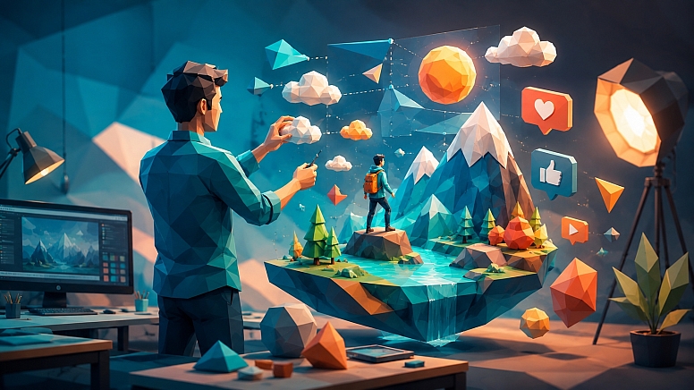
A useful structure is:
Subject + action + environment + visual metaphor + style + lighting + composition
For example:
- Subject: surfer
- Action: riding a large wave
- Environment: geometric ocean and distant mountains
- Visual metaphor: social-media engagement and rising popularity
- Style: colourful low-poly 3D editorial illustration
- Lighting: warm cinematic sunlight
- Composition: wide landscape composition with movement from left to right
Combining those elements gives the image generator a much clearer creative direction.
Describe the Composition
Composition matters just as much as the subject. If the image is going to appear inside a website article, a landscape composition is usually more useful than a square image.
You can specify things such as:
- Wide landscape orientation
- Strong central or off-centre focal point
- Clear foreground and background
- Negative space around the main subject
- Depth created through layers
- Movement across the frame
- Uncluttered composition
For example, placing the main character towards the left and allowing visual movement towards the right can create a sense of progression.
This is especially useful for topics involving growth, trends, journeys, or transformation.
Use Colour to Tell the Story
Colour can completely change the personality of an AI-generated illustration.
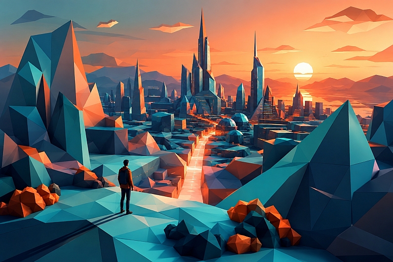
Low-poly artwork is particularly effective because the individual geometric facets naturally create subtle variations in colour and light.
Try combining a dominant cool colour with a contrasting warm accent. For example, cool blues and orange work beautifully for technology, growth and digital marketing concepts.
Other combinations can work too:
- Purple and electric blue
- Teal and coral
- Deep navy and yellow
- Green and magenta
- Orange and turquoise
You don't necessarily need to specify exact colour codes. Describing the overall palette is often enough:
Cool turquoise and deep blue tones with warm orange highlights.
This gives the image generator a coherent visual identity without making it feel overly rigid.
Don't Make Everything Equally Important
Another common AI image-generation mistake is trying to cram every part of an article into one image.
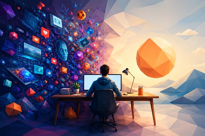
An article might discuss trends, social media, engagement, branding, originality, audience behaviour and analytics.
You don't need seven different objects representing all seven topics. Choose one primary visual metaphor and a few supporting details.
For the viral-trend example, the surfer is the hero element.
The wave represents the trend.
The social-media elements and upward arrow provide context.
That's enough. The image remains easy to understand.
Create Depth With Foreground, Middle Ground and Background
Low-poly scenes become much more interesting when they're constructed like a miniature 3D environment. Think about three layers.
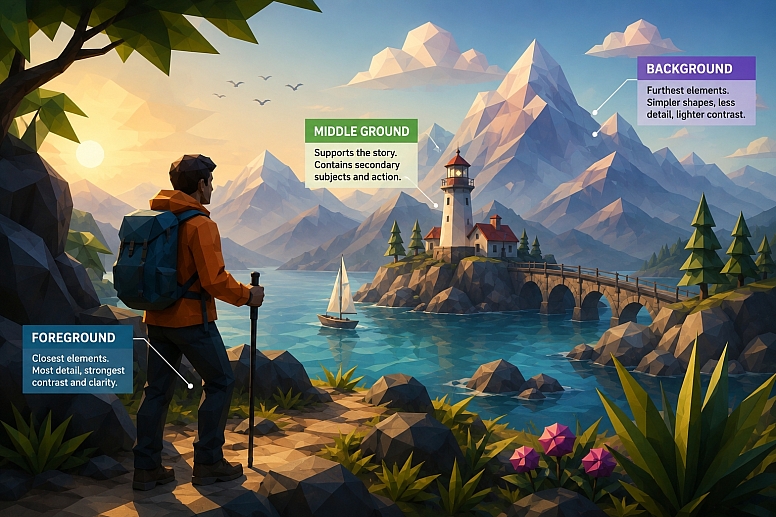
Foreground
This is where your main subject sits. It should usually contain the strongest visual detail.
Middle Ground
This supports the main story. It could contain waves, platforms, buildings, screens, floating objects, or other secondary elements.
Background
Keep this simpler. Mountains, clouds, abstract shapes, gradients, and distant architecture can establish the setting without competing with the subject.
This layered approach also helps prevent the image from looking like a collection of unrelated objects floating in space.
Add Movement
Static images can work, but editorial illustrations often become more compelling when there's an obvious sense of direction.
You can create movement through:
- Curved waves
- Rising arrows
- Flying objects
- Light trails
- Diagonal compositions
- Characters moving through the scene
- Floating geometric shapes
For a marketing article, an upward diagonal can suggest growth.
For a cybersecurity article, converging lines can suggest protection.
For a technology article, flowing data particles can suggest movement through a system.
Think about where the viewer's eye should travel.
Keep the Style Consistent
If you're creating several images for the same website, consistency is valuable.
You don't want one article to look like a photorealistic stock photograph, another to look like a cartoon, and another to look like a cyberpunk movie poster.
A reusable visual recipe can solve this. For example:
Vibrant low-poly 3D editorial illustration, faceted geometric forms, polished digital art, cinematic lighting, colourful conceptual storytelling, clean composition, subtle depth, modern technology and editorial aesthetic, wide landscape format.
You can then change the subject and metaphor while keeping the visual language consistent.
This is particularly useful for websites publishing lots of articles. Over time, the illustrations start to feel like part of the site's identity rather than random AI-generated images.
Use Reference Images When You Need More Control
Text prompts are not the only way to guide an image generator. Many modern AI image tools allow you to provide an image as a reference.
A reference image can help communicate things that are difficult to describe with words, such as:
- Overall composition
- Colour palette
- Object arrangement
- Visual style
- Pose or positioning
- Architectural structure
- Lighting direction
- General mood
For example, if you already have a low-poly illustration whose colour palette you like, you can use it as a visual reference when developing another image for the same website.
However, a reference image should be treated as guidance rather than an instruction to reproduce another creator's work exactly. If you use an image you did not create yourself, make sure you have the appropriate rights to use it with the relevant AI service and for your intended project.
From Concept to Finished Image
Once you have the concept and prompt, the next stage is generating the first version. Don't expect the first generation to be perfect.
In fact, it is often better to treat the first image as a visual sketch rather than a finished piece. Look at it critically.
Ask:
- Is the main idea obvious?
- Is there a clear focal point?
- Does the visual metaphor make sense?
- Is the composition suitable for an article?
- Are the colours working together?
- Is anything distracting from the subject?
- Does the image actually relate to the article?
If the answer to several of these questions is no, change the prompt rather than simply generating the same thing repeatedly.
Generate With a Clear Focal Point
Every strong editorial illustration needs somewhere for the eye to land. That could be:
- A person
- A building
- A device
- A vehicle
- An animal
- A landscape feature
- A symbolic object
For example, in the viral-trend illustration, the surfer is the focal point.
The wave provides the environment.
The social-media elements support the concept.
The rising arrow adds another visual cue.
If everything had the same size and visual importance, the image would become difficult to understand.
A useful prompt instruction is:
Make the main subject the clear visual focal point, with secondary elements supporting rather than competing with it.
That simple instruction can make a noticeable difference.
Don't Be Afraid to Generate Variations
Sometimes the concept is right, but the composition isn't.
Perhaps the subject is too small. Perhaps the background is too busy. Maybe the colours aren't strong enough. Or perhaps the visual metaphor works, but the scene feels static.
Generate another version with a specific change. Instead of completely rewriting the prompt, try changing one variable at a time.
For example:
Too static:
Create a low-poly illustration of a surfer riding a wave.
More dynamic:
Create a dynamic low-poly editorial illustration of a surfer aggressively carving across a towering wave, with strong diagonal movement and geometric spray flying behind the board.
The second version gives the image generator much more information about the desired energy.
Use Directional Language
Words describing movement and position can help shape the composition.
Useful terms include:
- Moving upward
- Racing forward
- Sweeping across
- Rising diagonally
- Converging toward
- Flowing through
- Expanding outward
- Floating above
- Emerging from
- Leading into the distance
These aren't just decorative words. They tell the image generator how different elements should relate to each other.
For example:
A glowing trail of data flowing diagonally from the lower left toward a futuristic city in the upper right.
creates a very different composition from:
A futuristic city surrounded by data.
The first contains an implied visual journey.
How to Avoid Common AI Image Problems
AI-generated artwork can look impressive while still containing small problems that become obvious when you examine it closely.
Common issues include:
- Duplicate objects
- Objects merging
- Unwanted text
- Random logos
- Distorted hands or fingers
- Unnecessary background details
- Inconsistent perspective
- Subjects that are too small
- Excessively realistic surfaces
- Scenes that do not clearly communicate the intended idea
You can reduce these problems by being explicit about what matters.
For example:
Minimal uncluttered composition, one clear focal subject, only a few supporting objects, consistent perspective, no logos, no watermark, no unnecessary text, clean geometric forms.
Some image generators also provide dedicated controls for excluding unwanted elements. When available, use those controls instead of relying entirely on a long negative prompt.
Troubleshooting a Weak Generation
| Problem | What to Change |
|---|---|
| The image is too cluttered. | Remove secondary objects and ask for a minimal, uncluttered composition. |
| The main subject is too small. | Ask for a large, dominant foreground focal point. |
| The image looks flat. | Add foreground, middle-ground and background separation with atmospheric depth. |
| It looks like a photograph. | Specify stylised low-poly 3D illustration, visible facets and geometric surfaces. |
| The colours feel chaotic. | Use a controlled palette with one dominant colour family and one or two accent colours. |
| The visual metaphor is unclear. | Return to the central concept and simplify the scene. |
| There is too much text. | Ask for no text and add typography separately during editing. |
| Objects merge. | Increase spacing between major objects and specify clear separation. |
| The scene lacks energy. | Add directional movement, diagonal composition, flowing elements, or stronger perspective. |
Refinement Is Where Good Images Become Great
The first generation may contain the right ingredients but still feel slightly wrong. This is normal.
Rather than abandoning the concept, identify the specific problem.
If the Image Is Too Cluttered
Try asking the image generator to simplify the composition and remove unnecessary background objects. Keep only the main subject and a few supporting visual elements.
If the Subject Is Too Small
Ask for the main subject to be significantly larger and more prominent in the foreground.
If the Image Looks Flat
Add strong foreground, middle-ground and background separation with atmospheric depth and cinematic lighting.
If the Colours Feel Chaotic
Use a controlled palette dominated by deep blue and turquoise with orange accents.
If the Scene Doesn't Communicate the Idea
Go back to the metaphor.
Sometimes the prompt isn't the problem. The concept itself needs changing.
Don't Try to Explain Everything Visually
An editorial image doesn't need to contain the entire article. Think of it as an entry point.
If the article is about social-media marketing, the image doesn't need to show a phone, laptop, social-media dashboard, charts, hashtags, likes, comments, followers, and a marketing team all at once.
That would probably make the image worse. Instead, choose one strong idea.
A surfer riding a huge social-media wave can communicate the concept more effectively than ten literal objects.
Leave Room for the Website Layout
Think about where the image will actually appear. A beautiful image can become awkward if important details sit too close to the edges.
For article images, leave some breathing room around the main subject.
This is particularly important if the image might later be:
- Cropped for mobile
- Used as a social-media preview
- Added to an article card
- Used in a newsletter
- Repurposed for Pinterest
- Turned into a promotional graphic
A composition with some negative space is much more flexible.
Generate Without Text When Possible
For editorial images, it's usually best to generate the artwork without headlines or paragraphs of text.
AI image generators can produce impressive typography, but text can still be inconsistent.
It is usually easier to add the title separately using a design application. This also gives you more control over:
- Font choice
- Font size
- Brand colours
- Positioning
- Accessibility
- Mobile cropping
The image should do the visual storytelling. The website design can handle the typography.
Edit the Image After Generation
Generating the image is not necessarily the end of the workflow.
A practical production process can look like this:
Concept → prompt → generation → critique → refinement → editing → optimisation → publication
Post-generation editing can include:
- Removing unwanted objects
- Replacing distracting elements
- Extending the background
- Adjusting brightness and contrast
- Correcting colour balance
- Adding a headline
- Adding a brand mark where appropriate
- Cropping for different layouts
- Upscaling when necessary
- Compressing the final web image
This is especially important for website graphics. The best AI generation is often only the starting material for the final design.
Use Reference Images When You Need More Control
Reference images can also be useful when you want several illustrations to share a similar visual language. A reference can help establish composition, colours, lighting, object placement, or general style.
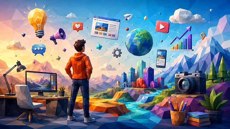
For example, you might create one successful low-poly technology illustration and then use its overall visual characteristics as inspiration for a second article image.
Just remember that using another creator's artwork as a reference does not automatically permit you to reproduce it. Consider the rights associated with the source image and the AI service before using the resulting work commercially.
Create a Recognisable Visual Language
Once you find a style that works, keep using the same principles.
For example, your visual recipe might be:
- Style: Low-poly 3D editorial illustration
- Geometry: Visible faceted surfaces
- Lighting: Cinematic and atmospheric
- Colour: Vibrant complementary colours
- Composition: Wide landscape with a strong focal point
- Storytelling: One central visual metaphor
- Background: Detailed but secondary
- Finish: Polished digital artwork
This becomes a visual system rather than a one-off prompt. You can then apply it to dozens of subjects.
A cybersecurity article can have a geometric fortress.
A web-development article can have a futuristic construction site.
An SEO article can have a mountain.
A social-media article can have a surfer.
They look completely different while still belonging to the same visual family.
Examples of Low-Poly Editorial Concepts
Cybersecurity
Instead of showing a generic padlock, imagine a glowing digital fortress made from geometric panels while streams of data approach it and are redirected around the structure.
SEO
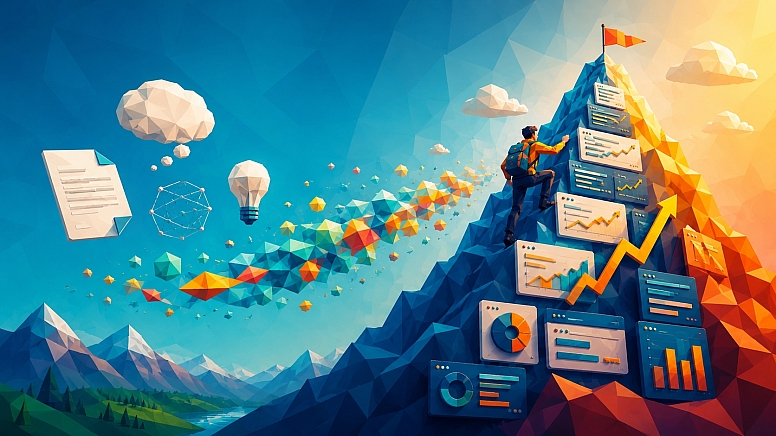
Instead of showing a search bar, create a low-poly mountain representing search rankings, with a climber moving upward through layers of search results.
Website Development
Show a designer assembling a futuristic website from floating geometric components, with code fragments represented as glowing blocks.
Artificial Intelligence
Create a large geometric brain or machine surrounded by interconnected data nodes, with a human figure controlling the system from a digital workstation.
Email Marketing
Show colourful paper planes travelling through a geometric network of connected inboxes, with some routes becoming brighter as engagement increases.
IT Asset Management
Create a central digital control hub connected to laptops, smartphones, monitors, servers and security symbols. The network represents visibility and control over a company's technology resources.
The subject changes, but the underlying process remains the same:
Find the idea → find the metaphor → build the scene → define the style → control the composition.
Building a Library of Reusable Prompts
If you're producing content regularly, save your successful prompts.
Create a simple prompt library containing sections such as:
Style
Vibrant low-poly 3D editorial illustration, faceted geometric surfaces, polished digital artwork.
Lighting
Cinematic lighting with atmospheric depth and dramatic highlights.
Composition
Wide landscape composition, strong focal point, layered foreground, middle ground and background.
Colour
Deep blue and turquoise with warm orange and coral accents.
Quality
Sophisticated modern editorial aesthetic, clean composition, detailed 3D forms.
Then combine those building blocks with a new subject.
Vibrant low-poly 3D editorial illustration of [SUBJECT] representing [CONCEPT], [ACTION/ENVIRONMENT]. Faceted geometric surfaces, polished digital artwork, cinematic lighting, atmospheric depth, deep blue and turquoise with warm orange accents, wide landscape composition, strong focal point, layered foreground and background, clean modern editorial aesthetic.
This saves time while keeping your images visually consistent.
Think About Image Size Before You Generate
The image's final destination should influence the composition from the beginning.
For a website article, a wide landscape image is generally a good starting point.
A 16:9 composition gives you plenty of horizontal space and works naturally with modern article layouts. For example:
- Article hero image → wide landscape
- Mid-article illustration → wide landscape
- Social post → square or portrait version
- Pinterest graphic → tall portrait
- Thumbnail → simplified landscape crop
If you know you'll reuse the artwork in several places, avoid putting the main subject too close to the edges.
Make the Image Work on Mobile
A landscape image that looks fantastic on a desktop monitor may not work when displayed in a narrow mobile layout.
Before finalising the artwork, imagine a vertical crop through the centre of the image.
Will the main subject still be visible?
Are important details positioned too close to the edges?
Does the composition still make sense if some of the background disappears?
If the image will have several uses, consider preparing alternative crops rather than forcing one composition into every format.
Optimise the Final Image for the Web
Generating a huge image does not mean you should serve that enormous file to every website visitor.
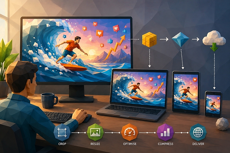
Before publishing, consider:
- Final display dimensions
- File format
- Compression
- Image quality
- Mobile requirements
- Page-loading performance
WebP or AVIF can be useful modern formats for many website images, while PNG can still make sense where transparency is required.
The goal is to find a sensible balance between visual quality and file size.
Make AI Illustrations Accessible
Accessibility should not be forgotten simply because the image was generated with AI.
If the illustration communicates useful information, provide descriptive alt text that explains its purpose.
For example, instead of:
Alt text: low-poly image
you might use:
Alt text: Low-poly illustration showing a central digital hub connecting laptops, servers, smartphones, and business technology assets.
If the image is purely decorative, the accessibility treatment may be different.
Also avoid placing essential information exclusively inside an image. Important information should remain available as HTML text wherever possible.
Consider Licensing and Commercial Use
If you are creating artwork for a business, website, client, advertising campaign or commercial product, check the current terms of the AI image service you are using.
Commercial-use rights, ownership provisions, content policies and other terms can vary between providers and may change as their services develop.
You should also be careful with reference images. Do not assume that because an image is available online, you are free to upload it to an AI service or use the resulting artwork commercially.
For client projects, it can be useful to keep a record of the AI tools used, the source material involved, and the applicable terms at the time the artwork was created.
This does not replace legal advice, but it is a sensible part of a professional image-production workflow.
Make the Image Work With the Article
A common mistake is treating images as decoration. The strongest editorial images actually reinforce the section they're placed beside.
For example, this article could use:
- Introduction: A finished low-poly illustration that demonstrates the style.
- Visual metaphor section: An image showing an abstract concept being transformed into a visual scene.
- Prompt-building section: A geometric creative workspace showing individual visual components coming together.
- Colour and composition section: A dramatic low-poly environment demonstrating depth and contrasting colours.
- Reusable prompt section: A collection of different concepts presented within one consistent visual style.
The reader isn't just looking at pretty pictures. They're seeing the principles being explained.
A Simple Workflow You Can Repeat
Once you've done this a few times, the process becomes surprisingly quick.
Step 1: Read the Article
Identify the main idea.
Step 2: Find the Metaphor
Ask what physical object, activity, or environment could represent that idea.
Step 3: Sketch the Scene Mentally
Decide what the main subject is doing and where it sits within the composition.
Step 4: Choose the Visual Style
For this approach, that means low-poly 3D, faceted geometry, vibrant colours and cinematic lighting.
Step 5: Write the Prompt
Describe the subject, action, environment, metaphor, colour and composition.
Step 6: Generate the First Version
Treat it as a starting point.
Step 7: Critique It
Look for clutter, weak composition, poor colour balance, strange objects or an unclear metaphor.
Step 8: Refine
Change the problematic elements rather than rewriting everything.
Step 9: Edit the Final Image
Correct unwanted elements, adjust the crop, add typography if required, and prepare the final file for its intended use.
Step 10: Optimise for the Web
Resize and compress the image appropriately and choose a suitable file format.
Step 11: Place It Where It Supports the Content
Don't simply scatter images throughout the article. Give every image a purpose.
The Difference Between an AI Picture and an Editorial Illustration
This distinction is worth remembering.
An AI picture can be visually impressive.
An editorial illustration has a job to do.
It communicates an idea. It creates context. It supports the written content.
It gives the reader a visual shortcut to understanding the subject.
That's why the strongest prompts aren't necessarily the longest ones.
They're the ones built around a clear idea.
A detailed prompt describing a random collection of objects can produce a complicated image.
A focused prompt describing one powerful metaphor can produce something much more memorable.
A Reusable Prompt Formula
Once you've found a visual style you like, you don't need to reinvent the process every time.
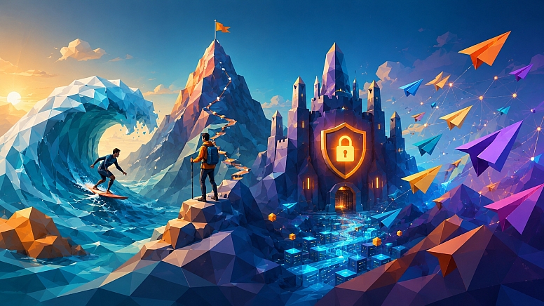
Use this basic formula:
Create a wide landscape low-poly 3D editorial illustration about [TOPIC]. Show [MAIN SUBJECT] [ACTION], representing [VISUAL METAPHOR]. Set the scene in [ENVIRONMENT]. Use [COLOUR PALETTE] with cinematic lighting, faceted geometric surfaces, polished 3D forms, atmospheric depth and a clean modern editorial composition. Make [MAIN SUBJECT] the clear focal point, with supporting visual elements including [SECONDARY ELEMENTS]. Create a strong sense of [MOVEMENT/MOOD].
No unnecessary text, no watermark, uncluttered composition.
The important part is replacing the placeholders with meaningful creative decisions.
Final Tips for Better Low-Poly AI Illustrations
- Start with the article's central idea.
- Use a visual metaphor instead of illustrating the title literally.
- Give the image one clear focal point.
- Use only a few supporting elements.
- Specify visible faceted geometry when the low-poly look is important.
- Think about foreground, middle ground and background.
- Use colour deliberately rather than throwing every colour into the scene.
- Leave negative space for website layouts.
- Consider mobile cropping before generating the image.
- Generate without text when typography needs to be precise.
- Use reference images when composition or visual consistency is important.
- Treat the first generation as a starting point.
- Change one problem at a time during refinement.
- Inspect the final image for duplicated or distorted objects.
- Optimise the final file before uploading it to your website.
- Write useful alt text when the image conveys information.
- Check the current AI service terms before using artwork commercially.
Creating Better Low-Poly 3D Illustrations With AI
Creating good low-poly 3D illustrations with AI isn't really about finding a magic prompt.
It's about combining creative thinking with good visual direction.
Start with the article.
Find its central idea.
Turn that idea into a visual metaphor.
Build a scene around the metaphor.
Then use colour, lighting, composition and geometry to give the scene a consistent visual style.
Once you've developed a repeatable approach, you can create illustrations for almost any subject without relying on generic stock photography.
And perhaps most importantly, you don't have to make every image look like everyone else's AI artwork.
The goal isn't simply to generate an image.
The goal is to create a visual idea worth remembering.
LEAVE A COMMENT




0.3123